Worthy Designs
While Madeworthy’s writers work to celebrate Fort Worth’s influencers and small business owners in prose, a team of dedicated designers works toward a similar aim — encompassing the essence of our city through captivating cover illustrations. Each issue of Madeworthy commissions an original cover image from our city’s leading graphic artists. Here are their stories.
Reverie Photo Co.
Unexpected praise from a kindergarten teacher sent Corey Jones toward his career in the visual arts.
“I drew a really cool picture in class,” he recalled. “My teacher was so impressed that she took me around to the other classes to show everyone… From then on, I was always creating things.”
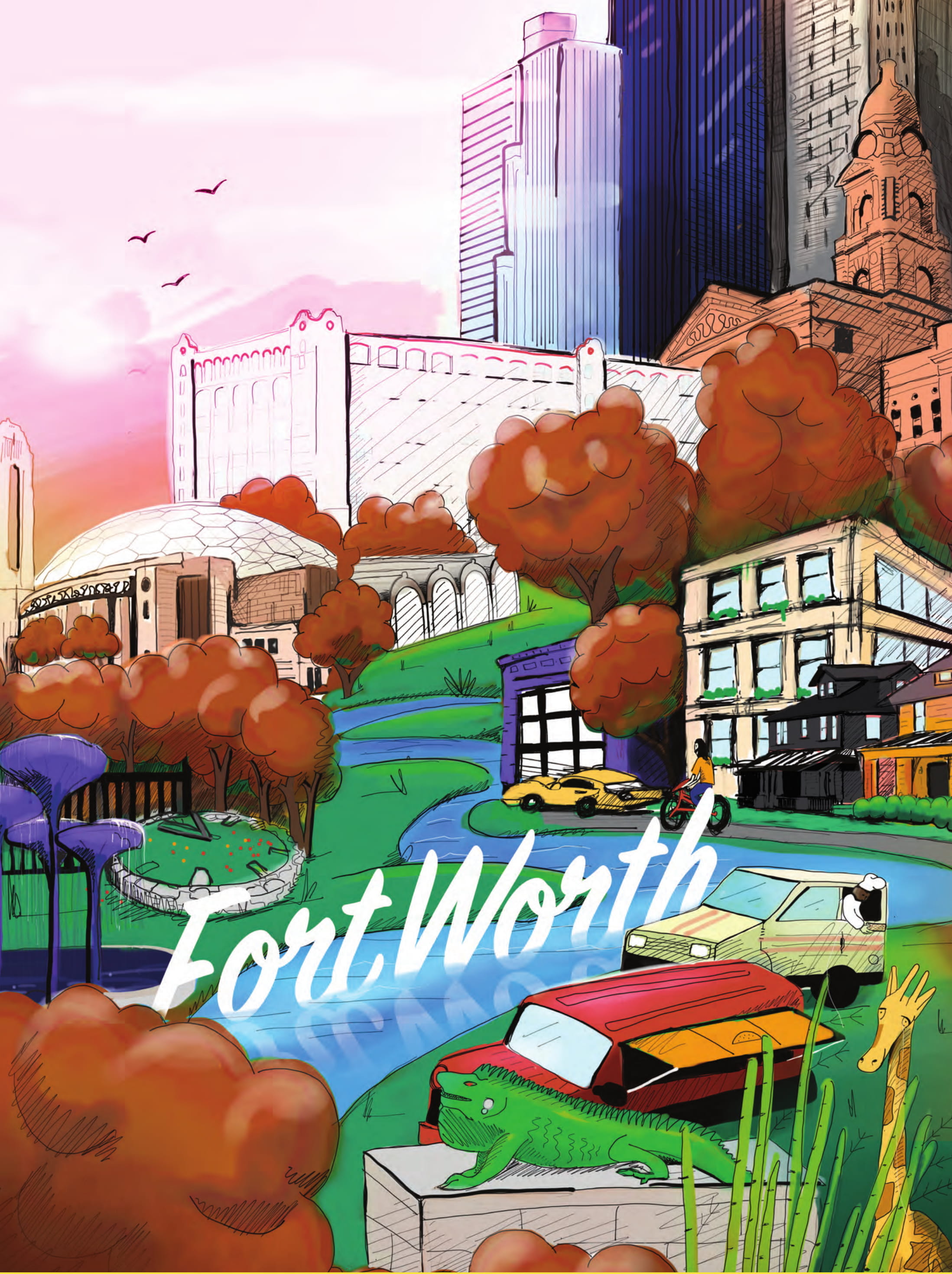
Jones is now a partner at Sovic Designs. For the inaugural issue of Madeworthy, Jones worked closely with publisher Victoria Wise.
“She had a few examples” of what she liked, Jones said. “We were on a short deadline. I applied a style that I could execute in that timeframe… I created all of it on an iPad.”
The final design elements were the colors. Wise wanted hues that suggested an “off and retro-y” feel. Relying on skills honed since kindergarten, Jones snuggly layered landmarks familiar to Fort Worthians.
Did launching the inaugural cover illustration leave Jones feeling pressured?
“There’s always a little pressure,” he said. “But it wasn’t overwhelming… I’m confident in my ability to produce… I was proud to be able to set the bar. Now, I’m excited to see what other artists” do with it.

Reverie Photo Co.
Architecture, clothing, nature — all are inspirations for Lauren Foster. Any image that catches her imagination are stored in a “vault” where they wait to help Foster work through creative roadblocks.
For Issue 2, Foster focused on “pretty and bright” colors that exude optimism. The Trinity River and downtown skyline firmly ground the illustration in Fort Worth.
“I wanted something that would catch people’s eyes,” she said. “I wanted something that represented the best parts of Fort Worth.”
An artist at heart, Foster’s intention was to create a work that could stand alone if framed. All her works are created with that possibility in mind. After a start designing wedding invitations, Foster consults on marketing projects, brands product lines, drafts original illustrations, and designs her own t-shirt line.
Her soon-to-be-launched “Icebreaker” line of shirts is intended to reflect the wearer’s ethos. The idea is to “break the ice in the sense that people will stop to talk about it,” she said.
Foster offers this advice to aspiring artists and designers.
“I tell young artists that [despite the trope of the ‘starving artist’] … so much of the world relies on good design,” she said. “Everyone has a creative bone. You just have to find it.”
Reverie Photo Co.
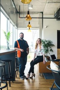
Projects at Ascend Concepts are team driven. When Chris Botvidson received the assignment for Issue 3, his group began collectively brainstorming.
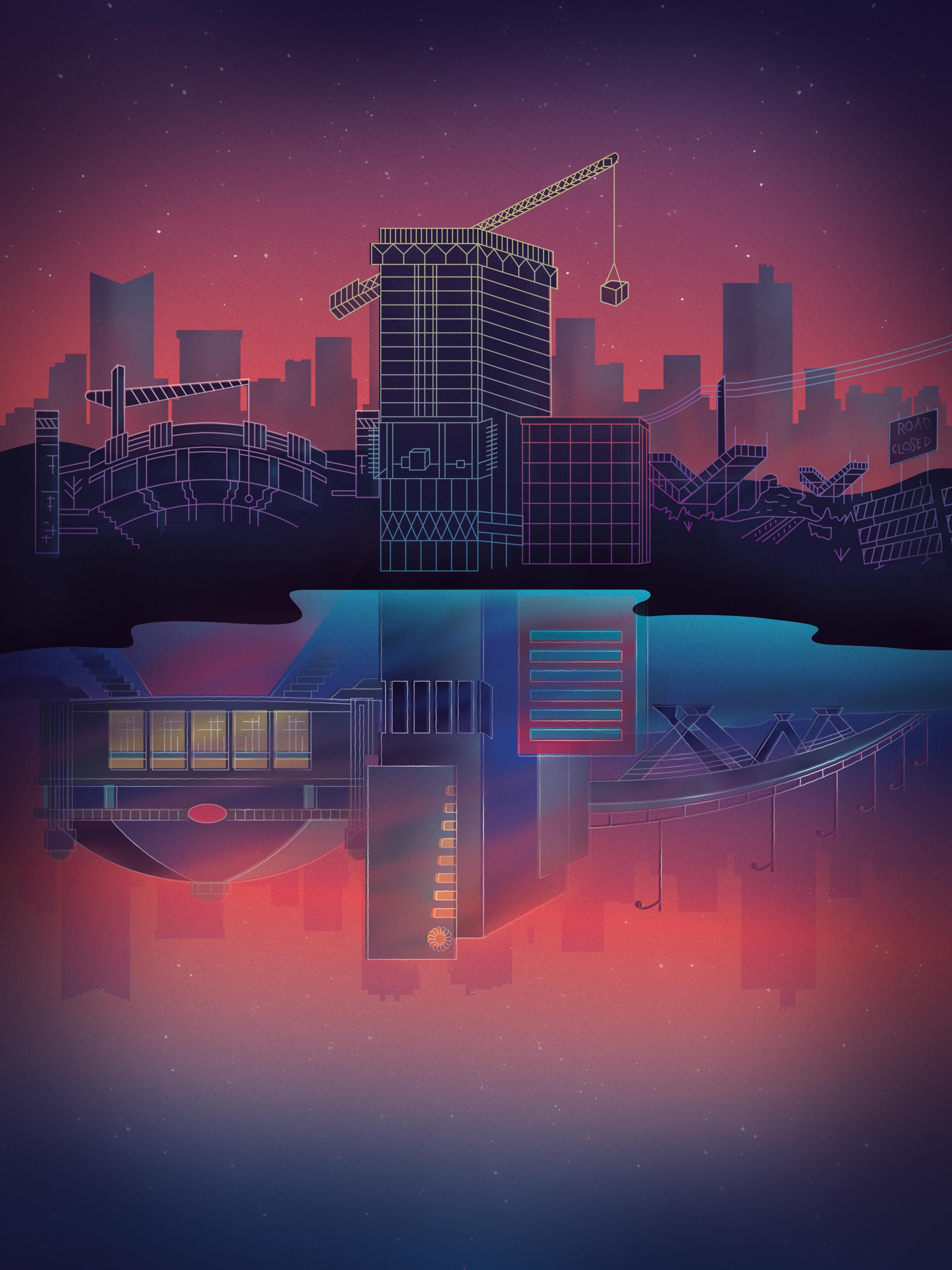
“Our theme was rejuvenation,” he said. “We wanted to showcase all the progress being made in our city.”
The color scheme reflects hues more common in sunrises than sunsets. Botvidson credits Paul Reid (who has moved on to another company) and art director Mary Daniels with flushing out the final design.
Daniels said the ideas soon converged on the omnipresent construction near Dickies’ Arena, downtown, and Panther Island.
“On top, you see construction,” she said. “It’s a pain… but it is creating something new and beautiful in our community. The reflection [on the water] is the vision of what that construction is to become.”
The initial rough sketch was refined and then illustrated digitally before the final product was brought to life via Photoshop. Ascend Concepts’ website design and branding handiwork have shaped local businesses such as TCU’s Neeley School of Business, Joe T. Garcia’s, and Panther Island Brewing.
“Our mission is to help our clients succeed,” Botvidson said. “We do that by energizing people’s brands. We have a strong commitment to creativity and the creative process. That’s our driving force.”
Reverie Photo Co.
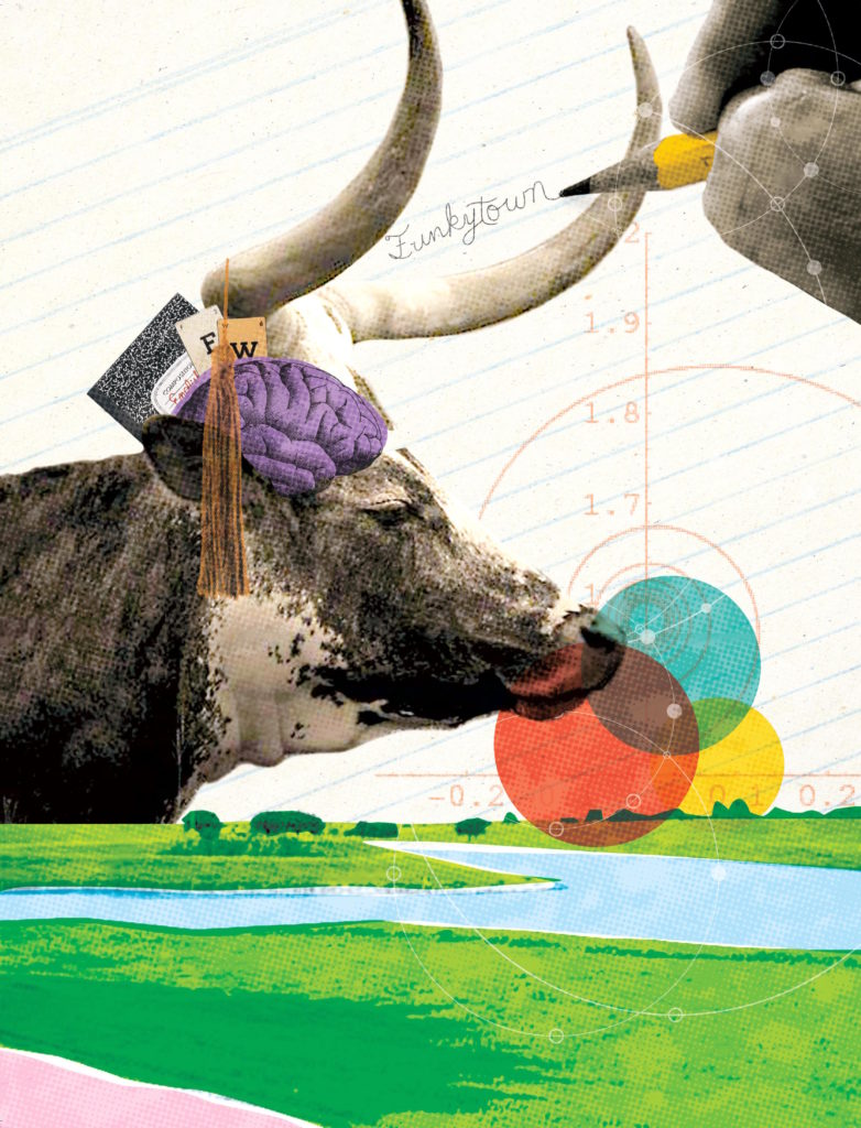
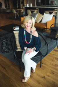
Cassie Kruemcke’s love of running shines through in her cover for Issue 4.
“I spend a lot of time on the trails,” she said. “I appreciate that we have such a fantastic trail system here in Fort Worth. I love the fact that we’re from Cowtown.”
After seeing how past Madeworthy illustrators featured Fort Worth’s skyline, Kruemcke knew she needed a different tack. The longhorn, an integral part of Fort Worth’s identity, makes a whimsical appearance. The bull also provides a humorous foil for the education-themed issue.
“I wanted to be different,” Kruemcke said. “I always approach things by solving the problem differently than those before me… When I’m doing something on my own, I’m drawn to layers and textures.”
Kruemcke is a self-described “voracious reader of periodicals, blogs, and websites.”
“I’m constantly looking for visual inspiration. I’m inspired by the most random of things. If I see a color on a piece of tile, neon designs, animals, or blades of grass, I try to jot them down.”
When the creative juices run low, Kruemcke has a time-tested solution.
“First, I get a cup of coffee,” she said. “Then, I change my [work] environment and [look through my collection of ideas.] Something always hits me.”

Reverie Photo Co.
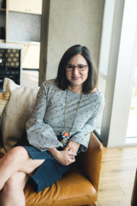
Holly Aguilar lives for that “aha” moment that occurs when she is working on a design problem. The senior art director at the Balcom Agency drew on 20 years of professional experience for the creation of her cover for Madeworthy’ Issue 5. Her task was to create a travel-themed cover from the perspective of a Fort Worthian.
“Growing up, I remember summer road trips with my family and seeing the city skyline disappear on the horizon as we embarked on our journey,” she recalled. “The decision to use a flat graphic approach consisted of familiarity with the illustration style, royalty-free resources, and print quality control.”
The theme of exploration resonated with Aguilar. She is an avid lover of outdoor photography and is happy for any excuse to get outside and capture something unique with her camera. She describes her work, which runs the gamut from digital advertising campaigns and corporate branding to social media campaigns, as “visual puzzles.”
The end goal of any project is to “see a great concept come to life,” she said.
Reverie Photo Co.
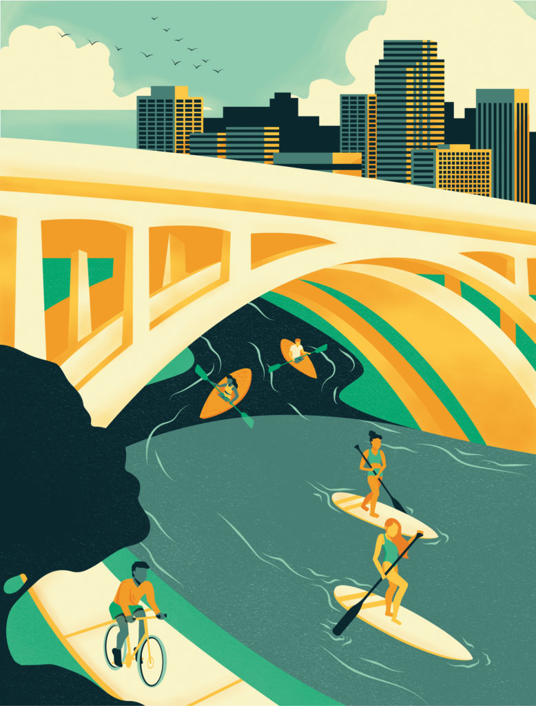
Graphic designers steer between trends and timeless elements. Sam Fleming, a partner at Evangalist, follows established artists on Instagram for insight and inspiration.
“I think illustrations are most compelling when they convey the most with the least,” she said, referring to her appreciation of monoline illustrations and tight-knit color palettes.
Those elements came to the fore in her cover illustration for Issue 6. She kept the color scheme minimal with five hues. After viewing past issues, she was please that, stylistically, the magazine cover designs invited creativity and uniqueness.
“I wanted [my cover] to convey summertime with warm and cool tones,” she said. “For me, water says summer in Texas.”
The illustration work was a fun project, but branding remains her passion. Branding is a company’s “visual story,” she said.
The process of distilling a company into a single message can be daunting. First, Fleming discusses the company’s vision with employees. Countless hours of research, mood boards, and color palettes later, the efforts manifest as rough drafts, which are then whittled down to several finalists. The final three are further flushed out before a winner is chosen.
“People define themselves every day,” she said. “We define companies that are made up of people. Putting visual identity to that and giving it life, it’s a rewarding element of my life.”

Reverie Photo Co.
Edward Brown is a writing tutor and piano teacher. He is also an award-winning writer for the Fort Worth Weekly and volunteers for numerous Fort Worth nonprofits.


 Sign in

